Case Study: "The Zookeeper's Wife"

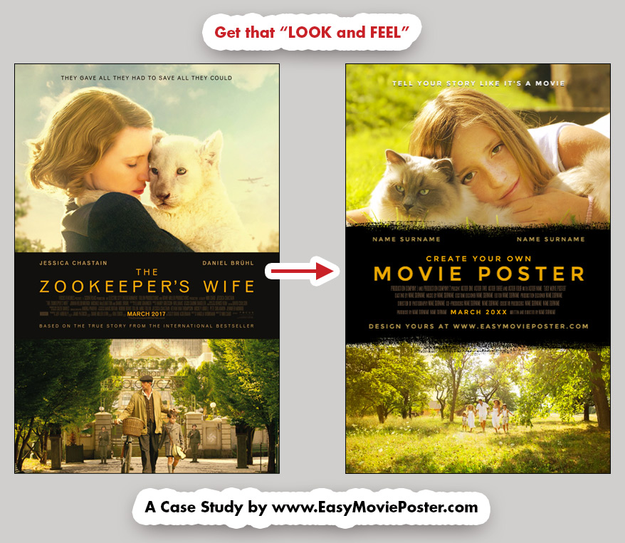
How to Get the "Look and Feel" of "The Zookeeper's Wife".


This kind of layout provides a classic timeless frame to tell a story.

Since two pictures are being shown, we can use both a close-up of the main character and a larger shot that sets the action in time and space.
It is perfect for a portrait, or for any story that takes place at a specific time or location.
Just choose the right pictures and the right colors, and it will always deliver!


Easy Movie Poster - Look And Feel - The Zoopeeker's Wife - Case Study

CHOOSE your TEMPLATE


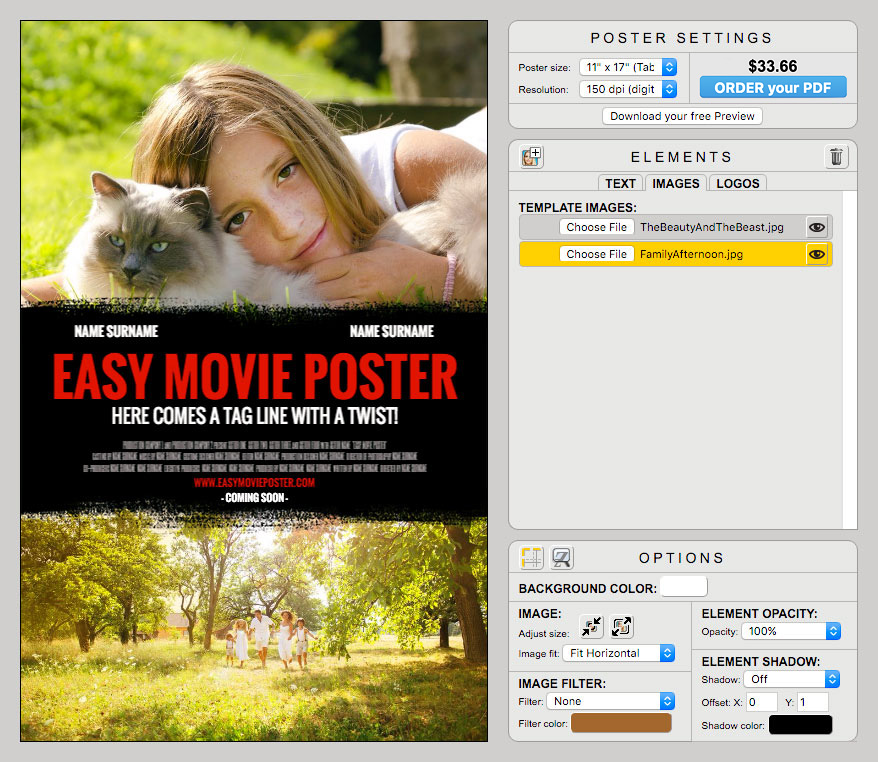
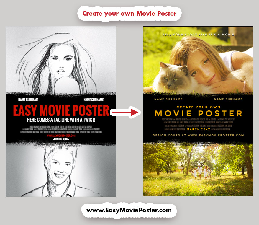
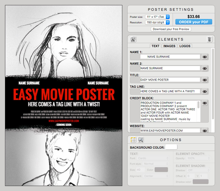
For this case study, we are going to use this Movie Poster Template.

It will allow us to display two pictures, and to place most of the text in a center black section, except for the tag line that we will reposition at the very top of the design.


Easy Movie Poster - Look And Feel - The Zoopeeker's Wife - Case Study

UPLOAD your IMAGES


Start by uploading your images.

For the top one, select a picture that expresses an emotion or an intimate moment.
For the bottom one, choose a picture that sets the story in time and place.

In our exemple it is a family afternoon in the countryside.


Easy Movie Poster - Look And Feel - The Zoopeeker's Wife - Case Study

TIP: Make sure both pictures cover all their allotted space.
To do so, select one of them in the ELEMENTS palette (click on the left side of the element: it should get highlighted in yellow).
In the OPTIONS palette, select IMAGE: Image Fit: Fill. That should give you a good starting point.
You can then enlarge your picture and reposition it if necessary.


CUSTOMIZE the TEXT


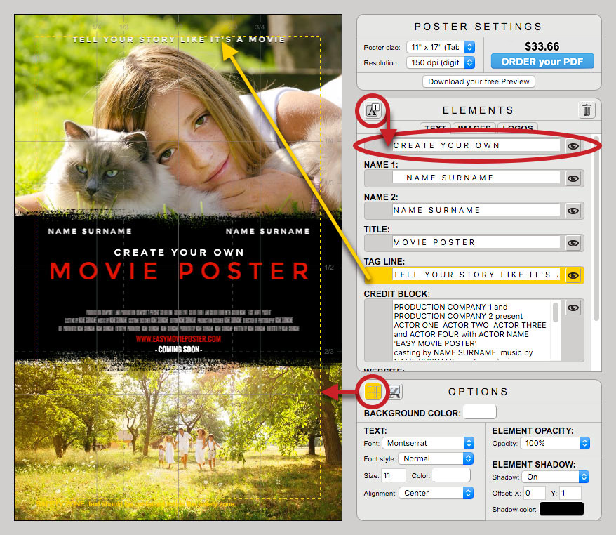
Change the font of each text element (except for the Credit Block) to Sans Serif: MONTSERRAT.

To create the wide spacing in the text, add one "space" between each letter, and make sure there's 3 "spaces" between each word. For instance "MOVIE POSTER" becomes "M O V I E   P O S T E R".
Enter your own text and then adjust the font size so that it fits nicely.


TITLE:

The original template only offers one line for the Title.
To add an additional line, click on the top left icon of the ELEMENTS palette. Select the new element (click on it in the palette) and position it in place using the arrows of your keyboard.


TAG LINE:

Select the Tag Line and move it to the top (we like to display the grid to make sure all fonts stay within the safety zone).
If the background is a light in color, use a dark font color.
If the background is a saturated or dark color, you can go for a bright or white font.

TIP: add a little drop shadow to accentuate the separation between a bright / light text color and the background. It will also make the Tagline "pop" a little more.


Easy Movie Poster - Look And Feel - The Zoopeeker's Wife - Case Study

CREDIT BLOCK:

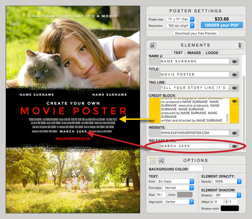
Split the content of the Credit Block on 4 lines.
Make sure the last line can be split in the middle and add plenty of "space".
Then select the Release Date Element, and movie it up, so that it fits in the center of the last line of the Credit Block.
For optimum effect, both the Credit Block and the Release Date should have the same font Size.

Easy Movie Poster - Look And Feel - The Zoopeeker's Wife - Case Study

COLORS


TEXT COLORS:

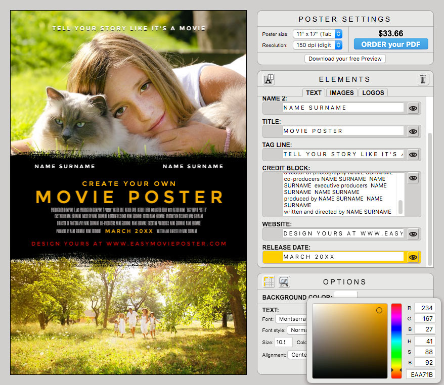
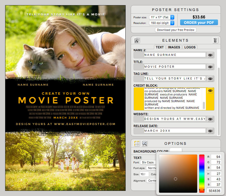
Choose a bright color for The Title and the Release Date (here: EAA71B).


Easy Movie Poster - Look And Feel - The Zoopeeker's Wife - Case Study

Choose a less saturated color for the Cast Names and the Website information (here: C0A057).
Choose a darker color for the Credit Block (here: 5E4836).


Easy Movie Poster - Look And Feel - The Zoopeeker's Wife - Case Study

SPECIAL EFFECTS


IMAGE FILTER and ELEMENT OPACITY:

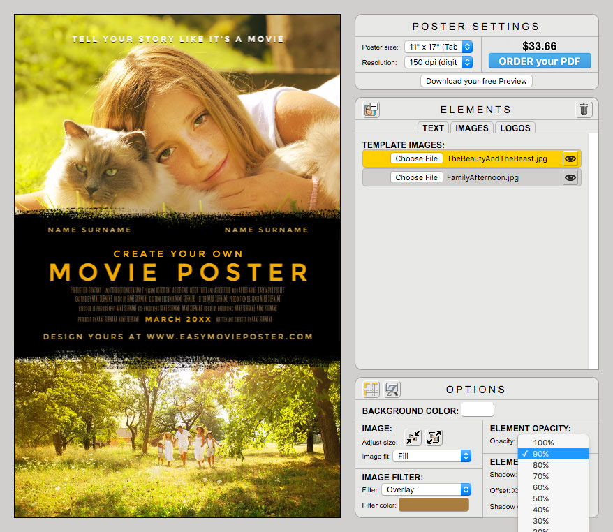
Adding a filter to the images will enhance some tones, will give a little more vintage cachet to the pictures, and will create an overall unity.

In this exemple, on the top image, we used an Overlay filter, Color A07C43, and lowered the Element Opacity to 90% to decrease the contrast (since the background is white).
On the bottom image we used an Overlay filter, Color 737161, and kept the opacity at 100%.
You will have to play around with these options to see what works best with your pictures and the feel you are trying to convey.


Easy Movie Poster - Look And Feel - The Zoopeeker's Wife - Case Study

ORDER your PDF


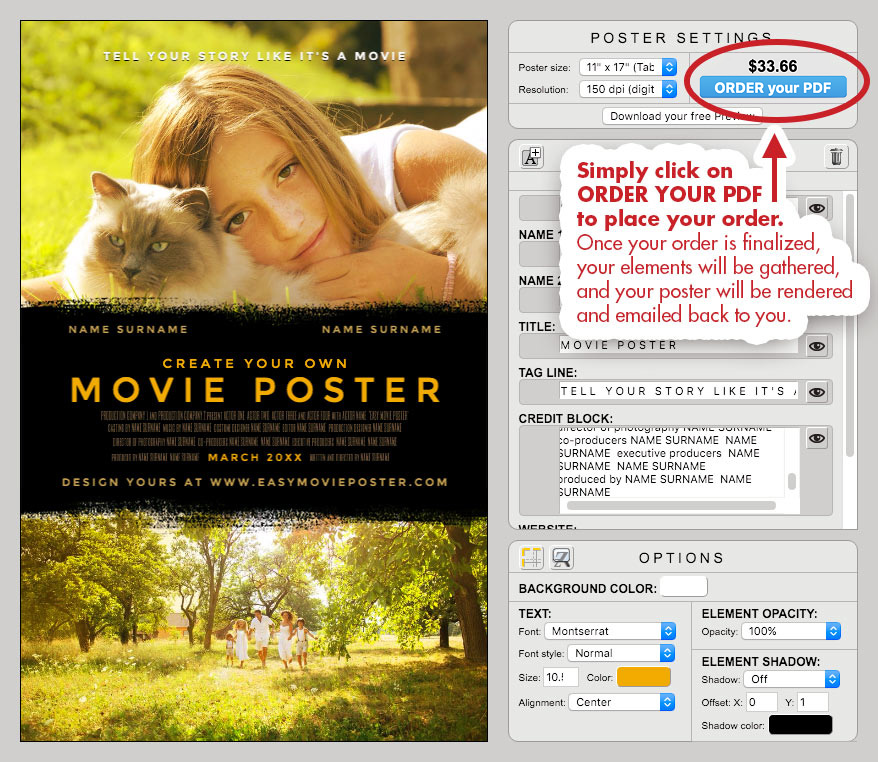
When you are ready, simply click on ORDER YOUR PDF to place your order.

Once your order is finalized, your elements will be gathered, and your poster will be rendered and emailed back to you.


Easy Movie Poster - Look And Feel - The Zoopeeker's Wife - Case Study

NOW it's YOUR TURN!


CREATE YOUR OWN VERSION:
We made it easy for you with a version of our Movie Poster Template where we prepared most of the elements according to our case study...so you can have fun with this "look and feel" right away!


Easy Movie Poster - Look And Feel - The Zoopeeker's Wife - Case Study

Ressources:

• Link to: "The Zookeeper's Wife" page on IMDb.
• Link to: the Movie Poster Template we used as a starting point in this case study.


Need a bit more help?

• Check out: our Getting Started page, and watch the short video for a crash course on how to use Easy Movie Poster™.
• For more detailed tips, check out our User Manual.
• If you still need more help or can't find what you are looking for, feel free to contact us. We'd be happy to help!

Have fun, and happy designs!


Browse our Movie Poster Templates and start your own design!