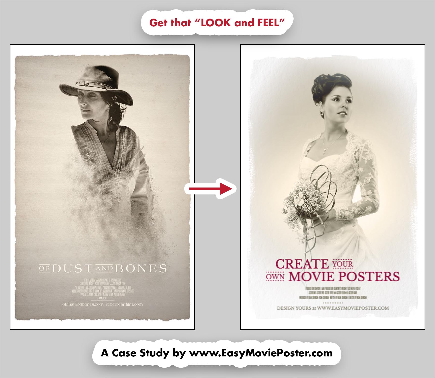
Case Study: "Of Dust And Bones"

How to Get the "Look and Feel" of "Of Dust And Bones".


Vintage, romantic, delicate, this "look and feel" is perfect for a portrait!

This template includes a paper texture and brush stokes which create a sophisticated touch. The white frames makes the picture really stand out as a piece of art.
All you have to do is upload a gorgeous picture, use a filter option, and you'll have a stunning piece. And if you'd like to take it to the next level, you can work on a fancy Title Treatment, to create something really unique.

Easy Movie Poster - Look And Feel - The Zoopeeker's Wife - Case Study

CHOOSE your TEMPLATE


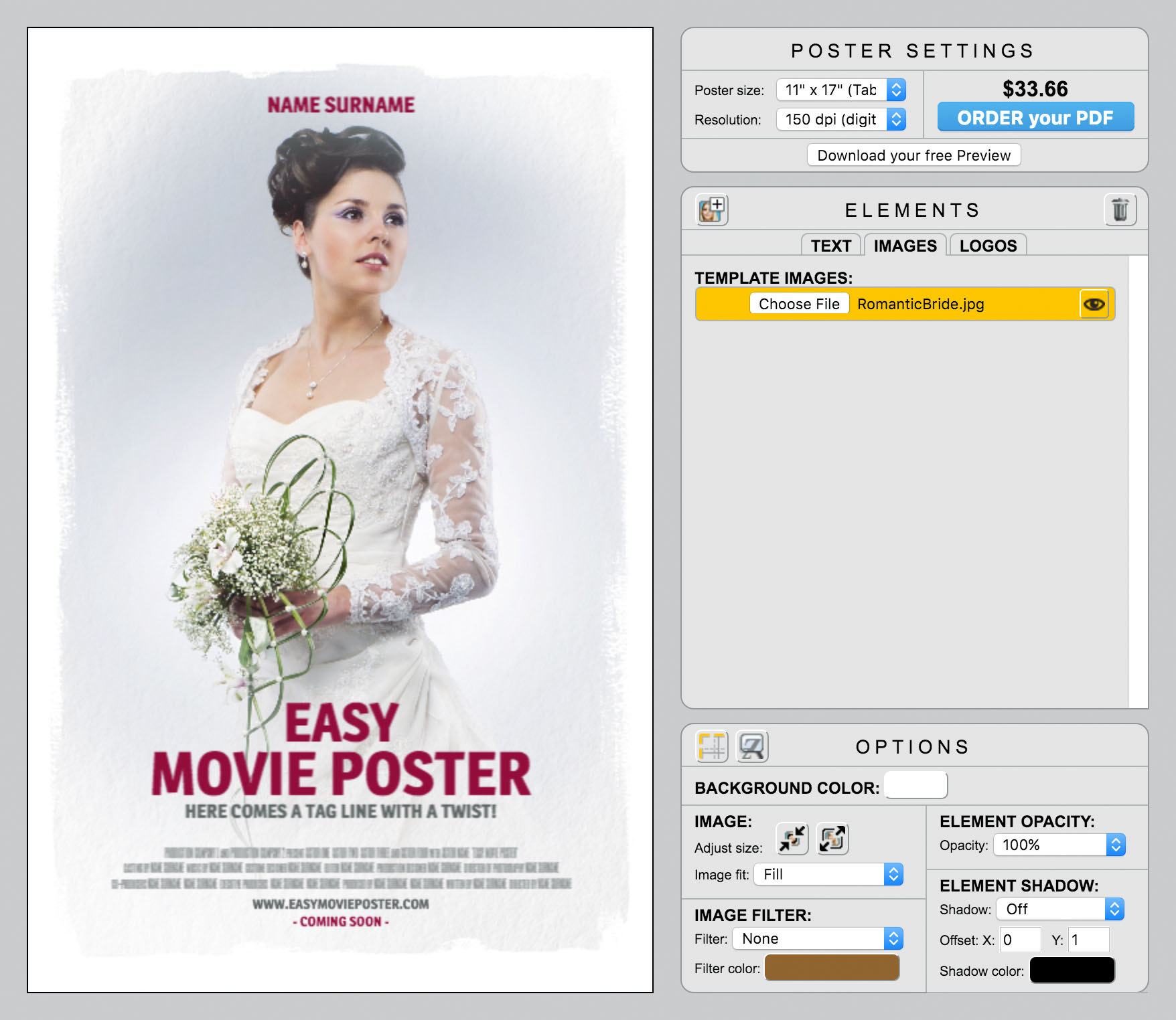
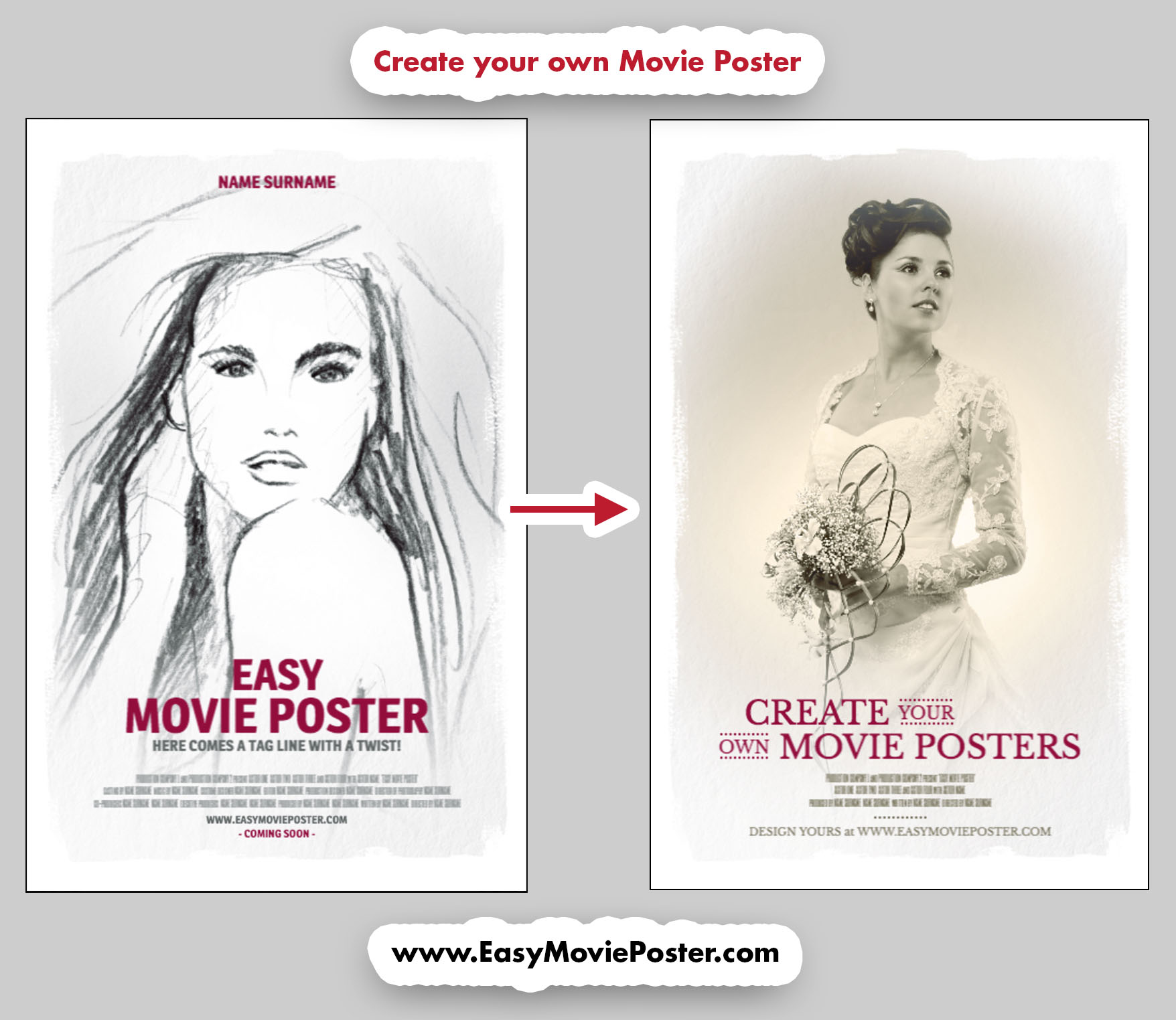
For this case study, we are going to use this Movie Poster Template.

It will allow us to upload one picture and to make the credit and website very discreet, so we can focus on a fancy Title Treatment. Less is more here, especially since the template already includes some paper texture.


Easy Movie Poster - Look And Feel - The Zoopeeker's Wife - Case Study

UPLOAD your IMAGE


Start by uploading your image.

Choose a picture that has a bit of contrast and beautiful light. A studio backdrop or a softbackground would work best.

In our exemple it is studio portrait, shot for a special occasion.


Easy Movie Poster - Look And Feel - The Zoopeeker's Wife - Case Study

TIP: Make sure both the portrait is well positioned in the composition.
To do so, select the picture in the ELEMENTS palette (click on the left side of the element: it should get highlighted in yellow).
In the OPTIONS palette, select IMAGE: Adujst size, and use the buttons to find what works best.


SPECIAL EFFECTS


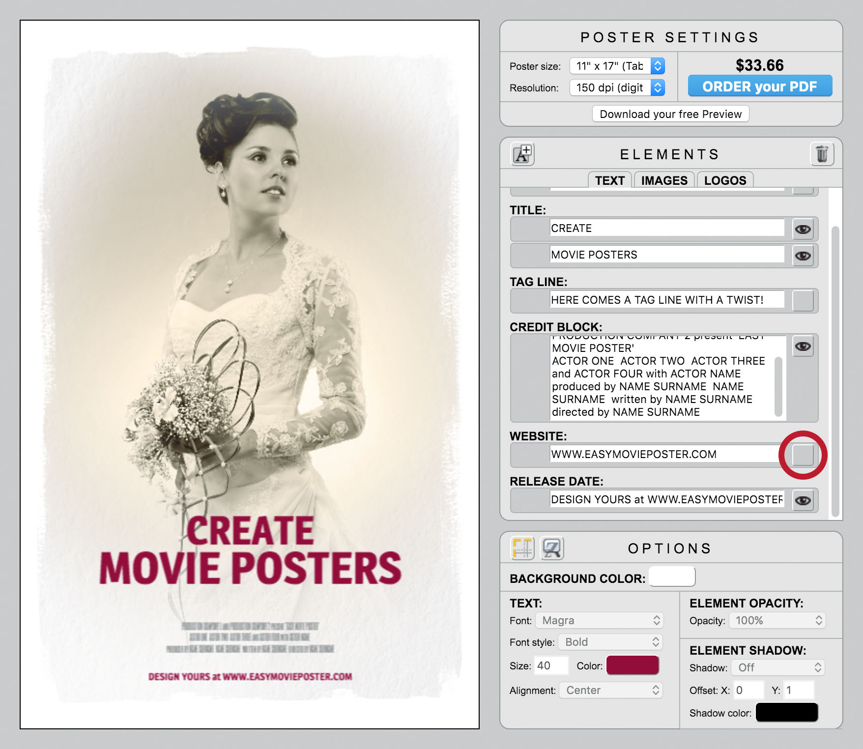
IMAGE FILTER:

Adding a filter to your portrait will create that vintage cachet, that we are looking for.

In this exemple, we used the filter "Color", and changed the tone to Color 817761 for a more metallic/grey soft touch.
You will have to play around with these options to see what works best with your pictures and the feel you are trying to convey. It opens up the doors to many possibilities, so you might end up going with something completely different!


Easy Movie Poster - Look And Feel - The Zoopeeker's Wife - Case Study

CUSTOMIZE the TEXT


ENTER your TEXT:

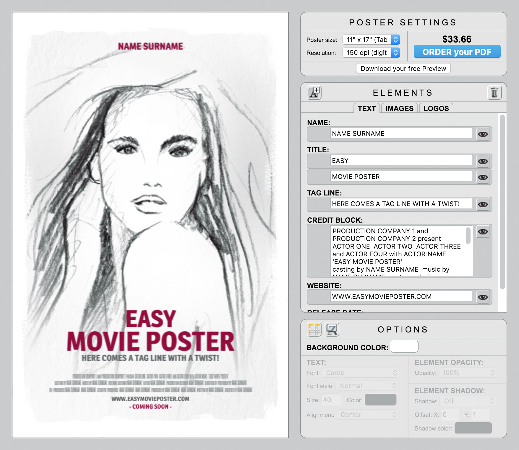
Enter your text in the ELEMENTS palette, and simply turn off the "visibility" icon for the text elements you won't be using.


Easy Movie Poster - Look And Feel - The Zoopeeker's Wife - Case Study

CHANGE the FONTS and POSITION the TITLE:

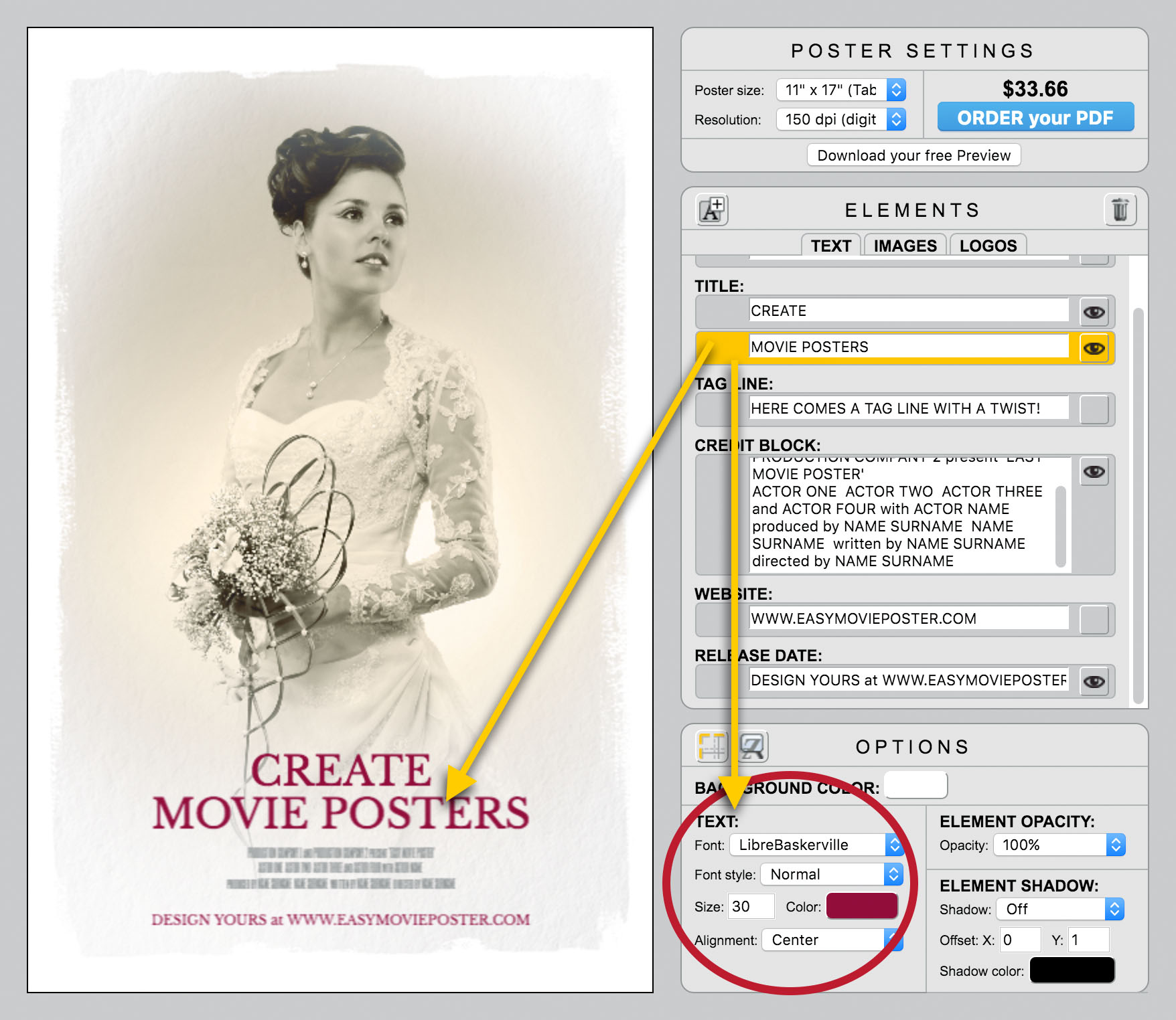
Change the font of each text element (except for the Credit Block) to Serif: LibreBaskerville, Normal.
In our example, the Title font size is 30, and the Release Date font size is 10.

Position the Title a bit lower.
To do so make sure the Text Element is selected in the ELEMENTS palette, and use the "down arrow" on your keyboard.
Tip: If you press the "Shift" key AND the "down arrow" on your keybaord, the text will move by ten units down instead of one.


Easy Movie Poster - Look And Feel - The Zoopeeker's Wife - Case Study

ADD some TEXT ELEMENTS:

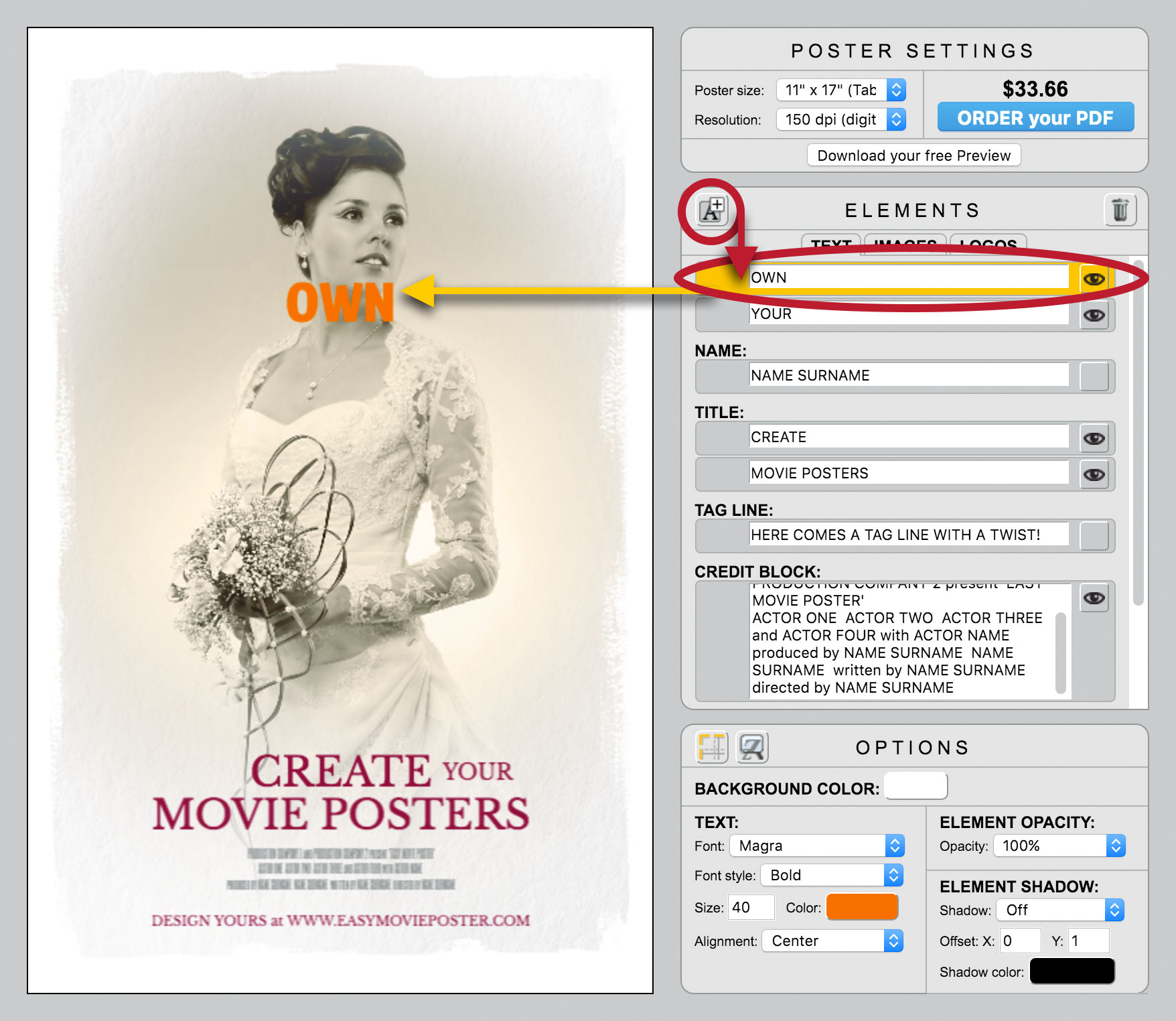
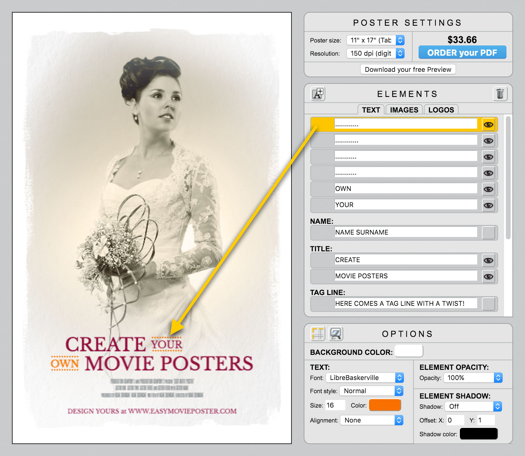
Click on the "Add Text" icon in the ELEMENTS palette, to create a new Text Element.
Could can then customize it and position it like any other Text Element.

In our example we added a Text Element "YOUR" and already changed its Font to LibreBaskerville, Normal, size 16, and we positionned it by the Title.
We are about to do the same with our new Text Element "OWN".


Easy Movie Poster - Look And Feel - The Zoopeeker's Wife - Case Study

POSITION the new TEXT ELEMENTS:

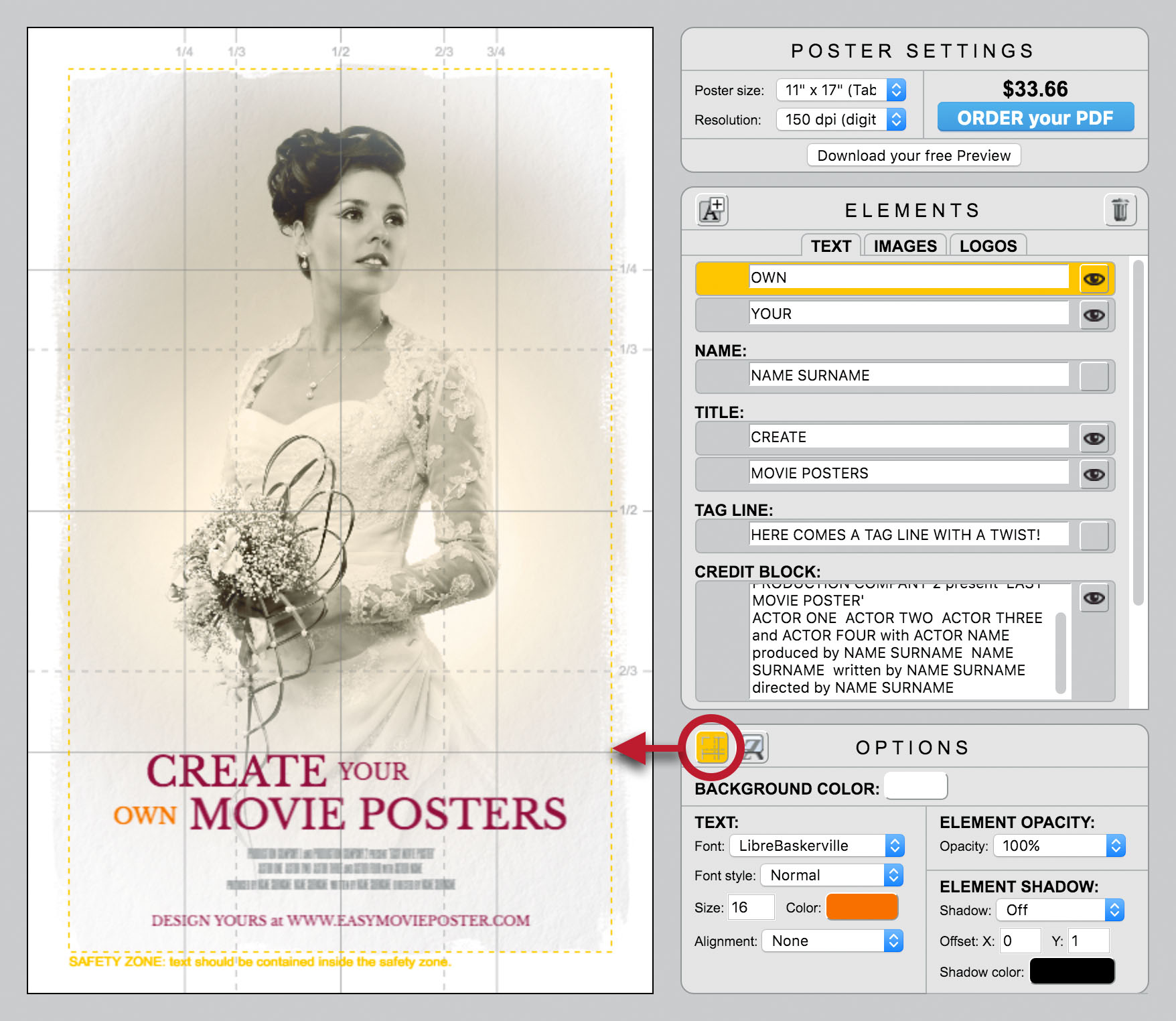
It can be helpful to display the GRID while positioning Elements.
In this case we have re-centered manually "OWN and "MOVIE POSTERS".
We also have moved "CREATE" and "YOUR" to the left to create a unity within the Title Treatment. Centered text is not always the answer, sometimes balance comes from a different composition.

Easy Movie Poster - Look And Feel - The Zoopeeker's Wife - Case Study

ADD dotted LINES:

In the same manner we added Text Elements, we can adddotted line. They are the same font and size as the text they frame, and they are simply position below and above the corresponding text.
That is a simple way to create more sophistication in our Title Treatment.

Easy Movie Poster - Look And Feel - The Zoopeeker's Wife - Case Study

COLORS


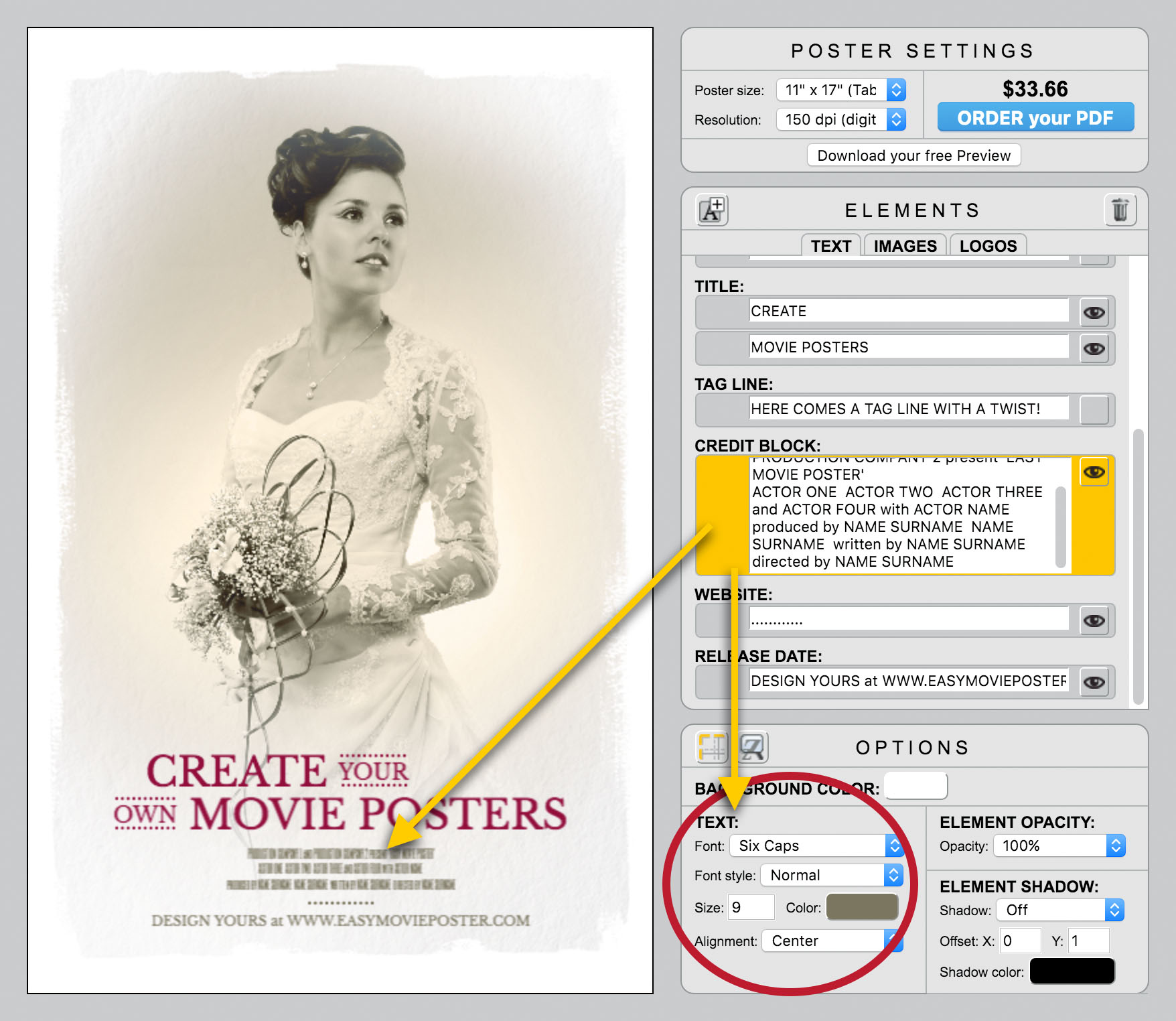
TEXT COLORS:

Make all the elements of the Title Treatment one color.
For overall unity, we make the Credit Block and the Release Date the same color as the filter color we used on the image.
We also added an additional dotted line, between those two elements.


Easy Movie Poster - Look And Feel - The Zoopeeker's Wife - Case Study

ORDER your PDF


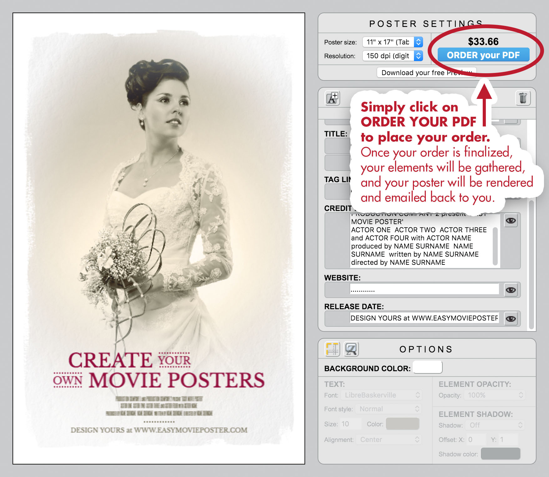
When you are ready, simply click on ORDER YOUR PDF to place your order.

Once your order is finalized, your elements will be gathered, and your poster will be rendered and emailed back to you.


Easy Movie Poster - Look And Feel - The Zoopeeker's Wife - Case Study

NOW it's YOUR TURN!


CREATE YOUR OWN VERSION:
We made it easy for you with a version of our Movie Poster Template where we prepared most of the elements according to our case study...so you can have fun with this "look and feel" right away!


Easy Movie Poster - Look And Feel - The Zoopeeker's Wife - Case Study

Ressources:

• Link to: "Of Dust And Bones" page on IMDb.
• Link to: the Movie Poster Template we used as a starting point in this case study.


Need a bit more help?

• Check out: our Getting Started page, and watch the short video for a crash course on how to use Easy Movie Poster™.
• For more detailed tips, check out our User Manual.
• If you still need more help or can't find what you are looking for, feel free to contact us. We'd be happy to help!

Have fun, and happy designs!


Browse our Movie Poster Templates and start your own design!